
By Julian Gagnon
In my last two articles I examined different areas of overlap between integrated marketing communication and multimedia journalism. Citizen journalists and content creators blur the lines between the two subjects. Other areas of overlap include two-way communication with the audience, responsibilities of the jobs, and skills associated with both. In this HoundBytes article I will explore theories behind data visualization, which are tools that could be used in IMC and MMJ. My next article will move on to the tools of data visualization.
Cairo (2013) introduced the traditional academic distinction between infographics and information visualization, where the former used charts, maps, and diagrams, while the latter allows the audience to analyze and interpret data sets. However, Cairo (2013) rejected this separation instead defining the two based on a continuum.
Infographics <——————-> Visualization
Presentation <——————->Exploration
He believed all infographics and visualizations have aspects of presentation and exploration that vary depending on the specific case. Cairo (2013) emphasized that the primary goal of infographics and visualization is conveying information, not producing art.
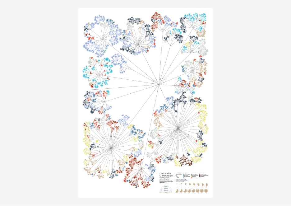
Stefanie Posavec’s Literary organism: A visualization of On the Road by Jack Kerouac. The different colors represent different parts of speech in the work.
Cairo (2013) went on to discuss the 1896 quote from Louis Sulivan, an American architect, that “form follows function.” Cario (2013) rejected this formula and pointed out that with infographics and visualizations, “the function constrains the form.” Put differently, the goals of visualization limit the options for display. An interview with Tufte (2004) published in Technical Communication Quarterly noted the importance of thinking about what tasks call for and the effect it has on design principles. For example, “show causality” is a different design principle than “show comparisons.”
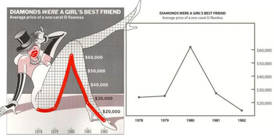
Nigel Holmes infographic published in Time magazine. This image was labelled as “chartjunk” by academics, who criticized its emphasis on art over information.
Academics have previously established seven stages for visualization of data: acquire, parse, filter, mine, represent, refine, and interact. Shapiro (2010) focused on the last three stages and added that he believed storytelling was the most overlooked skill in data visualization. Shapiro (2010) shared his formula for data visualization: Question + Visual Data + Context = Story. Similarly to Cairo (2013) who emphasized the importance of the goal of information, Shapiro (2010) felt the question that data sought to answer was the most important part of the equation. Questions should answer where, when, how much, or how often and provide context to the data that help viewers understand the topic. He also recommended that people with an interest in data visualization familiarize themselves with color theory, typography, computational data mining and programming.
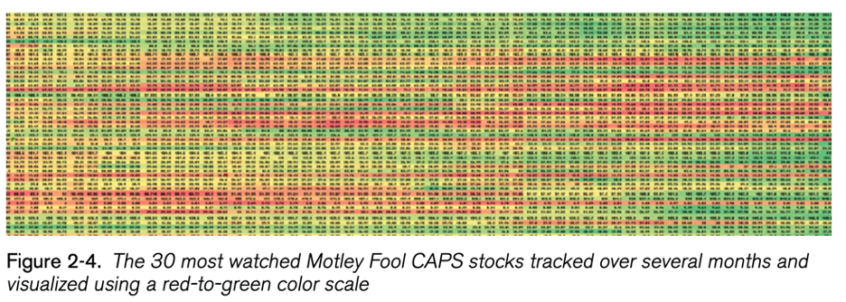
An image from Shapiro’s article that demonstrated one the best ways to use color in data visualization.
Based on the suggestions from Cairo (2013) and Shapiro (2010), I put together the following table to help you figure out which forms of data visualization work best with particular goals. It should be noted that there are multiple forms that could respond to different goals and questions. There is not always a correct method of visualization.
| Goals/Questions | Best Forms for Visualization |
| Differentiation between objects | Size |
| Large data sets without small ranges | Color |
| Location | Maps |
| Networks | Nexus renderings |
| Time | Timeline |
| Comparisons | Bar charts |
| Correlation | Scatter plots |
| General patterns and trends not precise comparisons | Bubbles |
References
Be the first to comment